Quick thank you card and a top tip for using label dies
Is there anything more lovely than getting a thank you card? Eh! Yeah!…. making one and letting someone know you appreciate them. Every month I send thank you cards to anyone that places an order the previous month (along with a little thank you gift). Today I am sharing one of the latest cards I sent because I am in love with the papers I used to make them and want to share its beauty with you all.
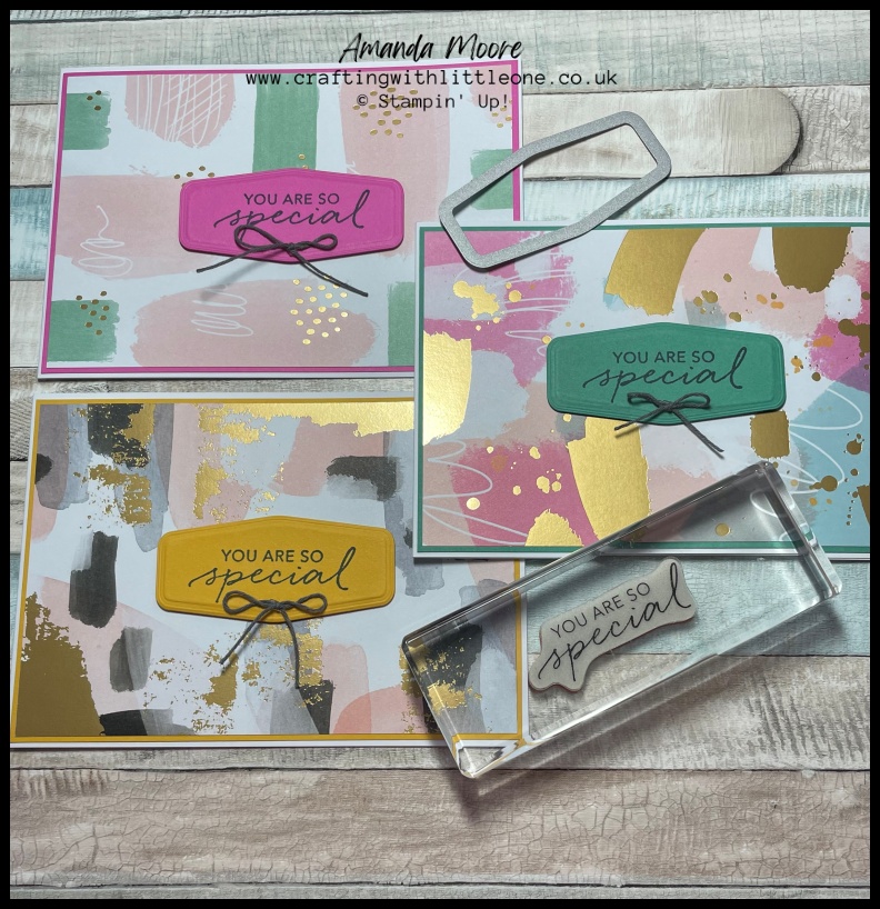
The designer series paper (DSP) highlighted in this project was the Abstract beauty DSP [158039] and with the gold foil elements it’s gorgeousness can totally pull off being the main focus of the card. I selected a colour from the DSP to incorporate in the coloured matt below. I used the same colour for the label die cut for the sentiment.
For those who have read my previous post about colour coordination (check it out here). But one of the joys of having DSP as a feature in a project is the genius packaging it comes in.
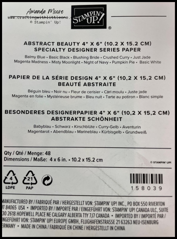
On the back of the packaging is a label and below the name of the product you will see listed all the colours that appear within this pack of designer series paper. Well, doesn’t that make it super easy to pull a design idea together? I always cut out and keep this label even if I remove my DSP from its original packaging. But don’t panic they are also listed in the catalogue on the DSP pages.
You’ll see within this project I used Magenta Madness(retired), Crushed Curry and Just Jade (retired)
Let’s take a closer look at these quick thank you cards…
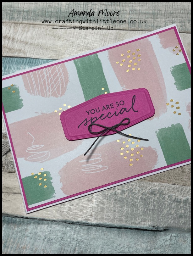
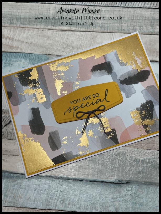
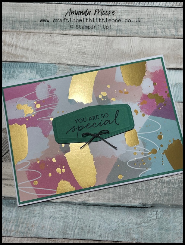
Anyone who has read previous tutorials will know I am a fan of making a basic white thick card base. Followed by a coloured matt layer. I do this to save my precious coloured card stock. You may also agree it is a better thickness (or weight) for a card base.
I added a piece of Designer Series paper to the colour matt. This paper pack is the unusual size of 4″ x 6″ (DSP comes in 6″ x 6″ or 12″ x 12″). This unique size is perfect for making a C6 sized card and having little waste. I cut a matching label dies after stamping a sentiment in Night of Navy ink. If you are frugal you can cut this from the colour matt before sticking it down. The hole left behind will be hidden behind the DSP layer.
The label I used is from a now retired, die set Tasteful labels. I am truly devastated this has retired – hence why I couldn’t not use it! There are loads of label dies and punches available that would be perfect. Final touch bow made from twine and job is done.
As promised a top tip when using label dies
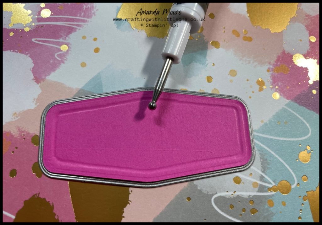
To make the most of the features of a label die for a more “cushioned” or “puffy” effect keep your die cut piece in the die. Flip it over so the reverse is facing you. Using an embossing tool such as one of the heads that comes with our Take your pick tool press gently to find the channel running against the edge of the die. Follow that carefully with the ball tool. Doing this creates a stepped feature that you can see pronounced on the Magenta Madness and Crushed Curry examples above.
Supply list
All the supplies used to create this project are available by contacting me or by clicking on the images below. Don’t forget for all orders between £25-£150 add the Shopping/Host code for a free gift from me next month.
For orders of £99, why not purchase the Starter Kit and get £130 worth’s of supplies for just £99
If you live in Northern Ireland (or wider UK) and don’t have a Stampin’ Up! Demonstrator, I’d love to be yours so just reach out if you need anything from a paper catalogue to flick through with a cuppa or some Stampin’ Up! products.
I hope you have enjoyed your visit to my page. I hope even more that you will be leaving feeling inspired. As I’m just starting out all feedback will be gratefully received. Please also get in touch if there is a topic, theme or technique that you would like me to cover in future posts or if you have any questions you can’t find the answer to within my site.